Wednesday, 26 January 2011

How did you use new media technologies in the construction and research, planning and evaluation stages?

          We used a mass amount of new technology for our project. The main part is the blog. We used our blogs to post all of our work onto so it covered all stages of the project, research, planning and evaluation. I think that the blog played a big part in being able to get on with work efficiently as it is accessible from anywhere with a computer and internet access which nowadays is almost everywhere. I noticed many people updating their blog from their phones which makes a big difference to the way in which our projects have progressed. Social networking sites such as facebook have also helped during the planning stage as our group created a page specifically for getting in touch with each other. This technology would not have existed years ago and therefore we would have to rely on each other to know what would be happening and when. this technology has enabled us to be efficient and organised.

          Youtube was also a very helpful tool in our project as it helped us during the research and evaluation stages. Before the start of our project we looked at other videos that students from around the country had created which helped us get an idea of what our final projects would consist of. For the evaluation it was used as a way to gain feedback. Thanks to youtube spreading a video around is quite easy as all you have to do is link it to other sites which takes a matter of seconds. This is a quick and easy method that would not have existed many years ago and therefore makes for a much easier way of viewing and analysing videos today.

         Other technologies we used consist of:
  • Camera equipment
  • Mobile phones
  • Green screen technology
  • Editing software
  • Photoshop
  • Lighting equipment
          All of this technology helped make the project possible. Things such as camera equipment, editing software and lighting equipment are essentials when it comes to constructing any type of moving image. We incorperated green screen technology into our project as it allowed us to get the type of dark imagery we were looking for in our video.

What have you learned from your audience feedback?

          Before we started coming up with ideas for our music video and the design of our digipack we had to research further into our target audience. This was extremely important as it would give us clear insight into how to taylor our video specifically to the audiences needs. We started off by holding interviews with Muse fans and asked them various questions relating to Muse imagery and their music videos. Questions such as:

"What is your favourite Muse video?"

"What would you like to see in a video for the song Time Is Running Out?"

         It helped us gain good insight into the thoughts of a Muse fan and what enabled us to create our initial ideas for our product. Unfortunately I was unable to post these interviews on my blog as the member of our group who filmed the videos did not send them to anyone before they left.

          When it came to gaining feedback on the finished products, there was not an awful lot to go on. We posted the video on facebook where it recieved a good amount of 'likes' and comments although many just said that it was a good video. However some of the critical comments were greatly appreciated as one comment suggested that our use of green screen could have been better. Upon looking back I think this comment was indeed most helpful as there is a green glow around the band shots and the video does lose certain quality.


Band shot with imposed background. There is a destinct loss
of quality when compared the a shot with no effects added.


Shot from our video with no effects added. Clearer picture.

          The remainder of feedback we recieved on facbook and youtube was mainly that of praise for the video and not critical analysis that we needed. If I were to re-do the project or start another similar project I would completely change my approach thanks to my audience feedback on this project. For example, the green screen comments are true and are something we have come to realise. Therefore if I were to go into another project that requires the use of green screen I would set aside some time to take some test shots so as to gain better insight into what would work well and what wouldn't and base the shots around those factors. I would also do more about gaining audience feedback. Posting the video on facebook and asking people to watch and comment was not enough and therefore I should have tried to market the video elsewhere. The best sights to use would have been muse messageboards, fan forums and fan-made websites such as these:

Official Muse Website

Unofficial Muse Website

          Not posting the video on these websites I think was a critical error and the main reason why we didn't gain mass amount of feedback.

Tuesday, 25 January 2011

How effective is the combination of your main product and ancillary texts?

          I think that the package works well together. The digipack had many conventional elements added in from our research as we discovered that many of Muse's album covers have a heavy space theme so we opted to include that theme on our digipack. We had already decided to use an image from our video as the front cover of our digipack as it would help relate it to the video itself and some bands often use such imagery. We also found that most bands use the same image from the front cover whilst advertising the album, it's only logical. Therefore we opted to do the same and we ended up with the following as our advert and the image as the front cover of our digipack.


          We also used the space theme on the digipack as it would help the fans identify the signature of the band and therefore would hopefully encourage them to buy the product. Most importantly, was the Muse logo. This was essential to include as Muse use this logo on everything that is officially theirs. This again helps the fans identify with the product and would be essential for the marketing of the product. 

Outside cover of the digipack. Includes space theme, clocks theme and Muse Logo.
          I think everything would work well as a package as the items all relate to each other and they can be clearly defined as a Muse product and that would be the main selling point, especially towards the intended target audience.

In what way does your media products use, develop or challenge forms and conventions of real media products?

In what ways does your media products use, develop or challenge forms and conventions of real media products?


          Whilst analysing Muse and various band within the Alternate Rock genre I found many themes that seemed to follow a trend throughout the genre. Muse in particular had many themes of their own that we tried to follow and replicate in our own products. When it came to music videos we found that Muse usually had very abstract story lines which is something used in our own video (character losing his grip on reality etc...) We found that these story lines are very much a convention of the genre and used them so as to appeal to our main target audience.
         We also found that for a lot of Muse's videos there is much faced paced editing which is something we included in our video. The beginning shots are very faced paced and rather disorientating and it's the same with the last few shots of our video. It gives the audience a disorienting feeling which links in well with the narrative as well as the conventions of the genre.
         A key convention of the genre would be the imagery. We looked at various bands in our research and we also looked closely at our audience to see what style of clothing is worn and we found that the members of Muse wear smart/ casual clothing in most of the videos and professional photos and that many of Muse's fan base try to model themselves on the band. Upon realising this we decided to give the band in our video the smart casual look so the target audience would be able to identify with this. 


          We also looked upon the instruments as imagery. Guitars, drums and bass guitars are a big part of the genre. The guitar in particular is seen as a stand alone part of the iconography. I looked into this in further detailed relation to Muse and found a particular interest in Matt Bellamy of Muse's guitars amongst the fans. These guitars could be considered conventions of Muse themselves so we decided to use rather colourful instruments. 


Colourful instruments.

Matt Bellamy of Muse with Red Glitter Guitar.
      

Completed Project.

Friday, 14 January 2011

Shooting Schedules


Story Boards

        These are the planned storyboards for our music video production of 'Time Is Running Out' By Muse. As stated in previous posts Muse go for very abstract story lines. The story we have come up with is about a man, our main character, who is losing his grip on reality and descending into madness as though his 'time is running out'. All of these are subject to change. Our idea's may change depending on situations when filming. 


          The opening shots consist of steady shots of different clocks. The shots will synchronise with the opening of the song where there are a series of claps and clicking fingers made to sound like a ticking clock. This is followed by our main character waking up. He should be rather rough looking and the mise-en-scene will consist of lots of empty alcohol bottles and rubbish.


          The next series of shots is the main character in our video going into his bathroom to splash his face with water. He looks in the mirror and see's a mysterious hooded figure. We will also have rubbish scattered around the bathroom to add to the idea of the characters roughness.


       After the character see's the hooded figure he steps back startled, looks down at his arms and see's the words 'Time Is Running Out' written all over his arms.


           The main character then drops to the floor with his head in his hands as the words 'time is running out' appear around him. Then we will inter cut with shots of the band we will film. 


          There are more shots of the band inter cutting with lots of fast paced close-ups and sped up edits of the main character to symbolise the descent into madness.


          In these shots the main character is starting to destroy everything, the bottles etc... He is tearing things down from the wall.


           Here there are shots of a clock and the numbers start to fall off symbolising the time running out.


          More shots of the band.


          He receives a call, the phone says 'Time Is Running Out'.

Completed Digipack

         These are our final Digipack Designs. As explained in an earlier post 
we added the space theme as it is a convention. We decided to go with dark colouring as it seemed relevant to the theme we were going for.

        An important part of the digipack is the Muse logo. We thought it essential to include this on the front cover and the two CD's as Muse use it on every album, single and EP they release. This not only helps fans identify with the band but is an essential convention of Muse albums.


          This is the completed Advert. In the original design there was a clock in the background that was faded. When we inserted this into the image however, it made the advert seem less professional so we decided to drop the idea and proceed with the dark background which worked better. We decided to use the same image for the front cover of our digipack and our advert as many bands do this and it can be considered a convention perhaps due to budget.


Digipack Plan

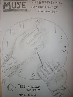
          For our Muse digipack we decided that we would promote a 'Greatest Hits' album rather than the album 'Absolution' from which Time is running out features from. These are the first designs.


          From our research we found that Muse tend to have space or conspiracy themed album artwork therefore making it a convention of Muse themselves and something we would have to try and include. Making this album a 'greatest hits' therefore would mean that we would not have to stick to one theme for the digipack. We added the space theme into one of the inside folds. We also decided to stick with the 'Time is running out' theme as it is a popular Muse song and therefore would help the fans identify it more as well as create some great imagery which is perhaps another convention of Muse's album artwork. 
          For the front cover of the digipack and for the advert we decided to use an image we'd thought about using in our music video. For Muse's own Time Is Running Out single cover they used a still image from the video itself so we thought we'd use ours to help the fans again, identify with it.

Still From Official Time Is Running Out Video
Official Time Is Running Out Single Cover

          We also decided to have a shot of the band we used in our music video. It goes against the alternate rock genre convention to have an image of the band on the front cover of a CD, it's very rare that a band in this genre would do so. However, many bands do have images either on the back of the album or in the middle of a digipack or the lyrics booklet that often come with the CD's. The Image is usually a studio shot Muse themselves have done this therefore we decided to add this to our digipack also.

Back Of Muse's First Album Showbiz

Thursday, 6 January 2011

Primary And Secondary Audience Research

          For our primary research we posed an interview with a big Muse fan. We asked him questions about his personal views on the band and the fans.

        For our secondary research we looked at alot of Muse forums and fan made films, groups and blogs. We found that Muse fans are an extremely dedicated group of fans. Alot of them make various videos or images and some even go as far as getting tattoos. Firsly we looked at the Muse forum on the bands main website, http://board.muse.mu/ . We posted on this but recieved no feedback. However there are many other threads on there that show how dedicated Muse fans are. One of the most interesting I found was this thread, http://board.muse.mu/showthread.php?t=47947 it's a thread about various items of clothing that the band themselves wear and where about the fans can buy them. So a lot of fans go as far as to model themselves on the band members. This thread gave us an insight into what the fans themselves wear which would help us dress the band members of our music video.


          Fans also choose to wear a lot of the muse clothing merchandise that can be bought from the website or at gigs.


          The fans also dedicate themselves to the muse imagery, such as the album art or the famous muse logo. Some like to draw pictures of them or create graphic designs, whereas some fans go to the extreme of getting tattoos.


          Alot of Muse fans learn their songs and record themselves performing the song and uplooad them to youtube. The most common is someone playing the guitar, they try to replicate some of the energy Muse have whilst playing live upon stage and this is something we will also look to replicate in our video.


          Other fans use other instruments such as piano as Matthew Bellamy plays them himself. Some fans do tutorials so other fans can watch and learn too....


            Some fans also learn the full songs and play the full version of the song all on one one instrument...


          Also I found out that Muse fans seem to have a particular connection with the guitars that Matthew Bellamy plays with. Most of all with the 'Manson Glitterati'. Alot of the fans try to replicate these guitars by either adding particular features from the Glitterati into their own guitars. Or by completely stripping down their own and repainting it to make it look like Matt's guitars.


          If you look at his collection of guitars he has lots of bright coloured, very 'out there' guitars. This is something we will use ourselves, try and get instruments that are brightly coloured.