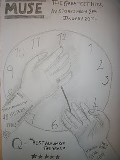
From our research we found that Muse tend to have space or conspiracy themed album artwork therefore making it a convention of Muse themselves and something we would have to try and include. Making this album a 'greatest hits' therefore would mean that we would not have to stick to one theme for the digipack. We added the space theme into one of the inside folds. We also decided to stick with the 'Time is running out' theme as it is a popular Muse song and therefore would help the fans identify it more as well as create some great imagery which is perhaps another convention of Muse's album artwork.
For the front cover of the digipack and for the advert we decided to use an image we'd thought about using in our music video. For Muse's own Time Is Running Out single cover they used a still image from the video itself so we thought we'd use ours to help the fans again, identify with it.
 |
| Still From Official Time Is Running Out Video |
 |
| Official Time Is Running Out Single Cover |
We also decided to have a shot of the band we used in our music video. It goes against the alternate rock genre convention to have an image of the band on the front cover of a CD, it's very rare that a band in this genre would do so. However, many bands do have images either on the back of the album or in the middle of a digipack or the lyrics booklet that often come with the CD's. The Image is usually a studio shot Muse themselves have done this therefore we decided to add this to our digipack also.
 |
| Back Of Muse's First Album Showbiz |


No comments:
Post a Comment